
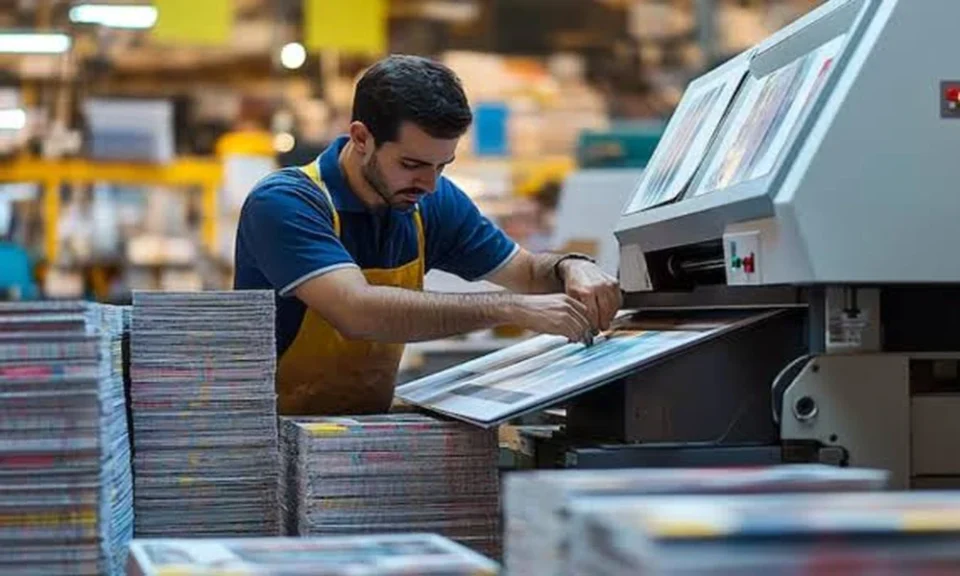
Lopsided logos, blurry images, and vanishing text hidden behind banner stands, printing disasters like these cost money, time, and credibility. Most of these headaches trace back to a single root problem: poor artwork preparation. Print-ready design isn’t just about looking good on your screen; it’s about anticipating how your artwork will interact with real-world materials and machines.
Why Artwork Preparation Matters in Printing
Nothing kills a first impression faster than a banner or poster riddled with errors. When artwork is sent to print without proper setup, the result can be ill-fitting graphics, washed-out colors, or crucial information chopped off. These problems are common but avoidable.
Understanding Common Printing Issues
From pixelation to unintentional cropping, the usual culprits of print failures start at the design stage. Files designed in RGB instead of CMYK produce unpredictable colors, and low-resolution images that look fine on a monitor become grainy on vinyl or paper.
Impact of Poor Artwork on Final Prints
A single oversight, such as placing text outside the safe zone or skipping bleed, can render a piece unusable. Costs mount: reprints, lost event opportunities, and a diminished brand presence. That’s why professional printers constantly emphasize artwork guidelines.
Case Study: Roll-Up Banner Printing Challenges
Roll-up banners are a staple at tradeshows, but their unique format introduces pitfalls for the unprepared designer.
Material and Size Constraints
Vinyl banners (like the popular 13oz matte vinyl used for retractable banners) need files sized at 33″ x 81″. Designers must remember that not every inch of this space is visible, particularly the lower portion that sits behind the stand.
Effects of Incorrect Bleed and Trim Settings
Failing to add the required 0.5-inch bleed on all sides means the final banner might show unwanted white edges or chopped graphics. Similarly, omitting a safe zone (keeping important text and images at least 1 inch inside the trim) makes key elements vulnerable to being cut off.
Real-World Example: Hidden Elements Behind the Stand
A common mistake? Placing logos or messages in the bottom 3 inches, only to find them concealed by the hardware. Detailed instructions from providers like banner printer in Montreal Doculand spell out these constraints, yet rushed or careless prep still causes costly flubs.
Mastering Bleed, Trim, and Safe Zone Settings
Getting these basics right is the foundation of print-ready artwork.
Defining Bleed and Its Importance
Bleed is the extra space (typically 0.5 inches on all sides) that extends beyond the final cut. It ensures that colors and backgrounds print edge-to-edge, preventing unsightly slivers of unprinted material.
Aligning Artwork Within the Safe Zone
The safe zone acts as an interior margin. By keeping vital content (text, logos, key visuals) at least 1 inch inside the finished size, designers protect it from being trimmed off during cutting. This small step preserves both message and aesthetics.
Avoiding Common Mistakes Through Proper Margins
Ignoring these margins leads to clipped words and mutilated graphics. Reviewing template guides and double-checking artwork positioning helps catch errors before sending files to print.
Color Management and Resolution: Keys to Vibrant Prints
A banner that looks dazzling on your laptop may end up dull or pixelated in real life if color mode and resolution are neglected.
Why CMYK Color Mode Is Essential
Digital screens use RGB, but all professional printers require CMYK. Files submitted in RGB can produce unexpected shades; what looks deep blue on monitor may print as purple. Converting to CMYK ensures color consistency.
Resolution Standards: Why 150dpi Works for Large Format
Large-format banners don’t need ultra-high resolution, but anything below 150dpi will look pixelated up close. With proper prep, even bold images appear crisp and professional at full size.
Case Example: Color Shifts and Pixelation Problems
Designs not converted to CMYK or saved at low resolution frequently come back from the printer looking faded or jagged. These avoidable issues are the main reason for print job rejections.
File Formats and Font Handling for Seamless Printing
Even perfect-looking artwork can fail if file types and fonts aren’t handled correctly.
Why PDF with Outlined Fonts Is Preferred
PDFs lock in every element as intended and, when fonts are converted to outlines, text cannot be replaced or rendered incorrectly. This standard eliminates missing font issues that often arise with native files.
Troubleshooting Font and File Submission Issues
Submitting editable files or forgetting to outline fonts can result in the printer substituting the wrong typeface, altering your design. Double-check converted text and flatten layers to prevent accidents.
Lessons Learned from Failed Print Jobs
Files accidentally sent with unembedded fonts or layered PSDs can delay jobs or force costly corrections, risks that vanish with a simple PDF export.
Best Practices for Artwork Submission
Taking a few extra minutes to follow proven steps can make the entire printing process smoother.
Using Templates for Accurate Dimensions
Most printers offer downloadable templates (such as 33″ x 81″ for roll-ups). Starting with these ensures your design fits the actual product specs and hardware.
Communicating Special Instructions to Printers
Include notes about bleed, safe zones, or areas to be hidden by stands. Clear communication avoids confusion and ensures your intent matches the final output.
How Proper Prep Speeds Up Processing Time
Well-prepared files reduce back-and-forth with the print shop, enabling faster turnaround, crucial for tight event deadlines.
Final Takeaways from Real-World Printing Successes
Meticulous artwork preparation isn’t just about preventing mistakes; it empowers your brand with consistent, eye-catching visuals.
Summary of Key Preparation Steps
– Always use the correct file dimensions and resolution
– Include appropriate bleed and safe zones
– Submit PDFs with all fonts outlined
– Use provided templates and carefully review all special instructions
How Proper Artwork Preparation Saves Time and Money
Investing a little extra care at the design stage eliminates the expense and hassle of reprints, protects your timeline, and delivers a better end product for your audience.
Encouraging Consistency for Repeat Print Jobs
Establishing a checklist for every print project helps ensure flawless banners, posters, and signage every time, building trust with clients and audiences alike. Proper preparation is the secret weapon for stunning, reliable printed materials.
